
Industry
Precision diagnostics
What we did
Rebrand, logo design, brand guidelines, presentation design

Industry
Precision diagnostics
What we did
Rebrand, logo design, brand guidelines, presentation design
Guilford Street Labs (GSL) sits at the leading edge of diagnostics. By combining AI with decades of scientific expertise, they deliver cutting-edge biomarker assays and diagnostic solutions that help accelerate clinical development and, ultimately, improve patient outcomes.
Their original brand, created at the company’s inception, wasn’t keeping pace with their growth. In a sector where the stakes are high and credibility is everything, most competitors play it safe. The landscape is dominated by cool colours, cautious typography and interchangeable logos, all built on the assumption that looking conventional means looking trustworthy. The result is a category full of brands that are hard to tell apart and easy to forget.
GSL wanted to break away from that. They needed a brand that reflected the innovation behind their work and made them instantly recognisable to pharmaceutical and biotech partners. But standing out couldn’t come at the expense of confidence. Their audience relies on the accuracy of their data to make critical decisions, so the new identity had to feel just as dependable as it was distinctive.
We challenged the category’s core assumption: that trust has to look boring. In science, trust comes from clarity, precision and consistency, and a brand can embody all three while still having a voice of its own.
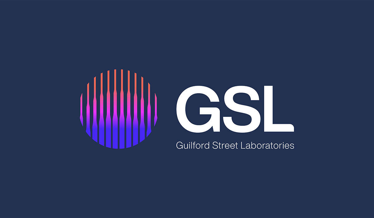
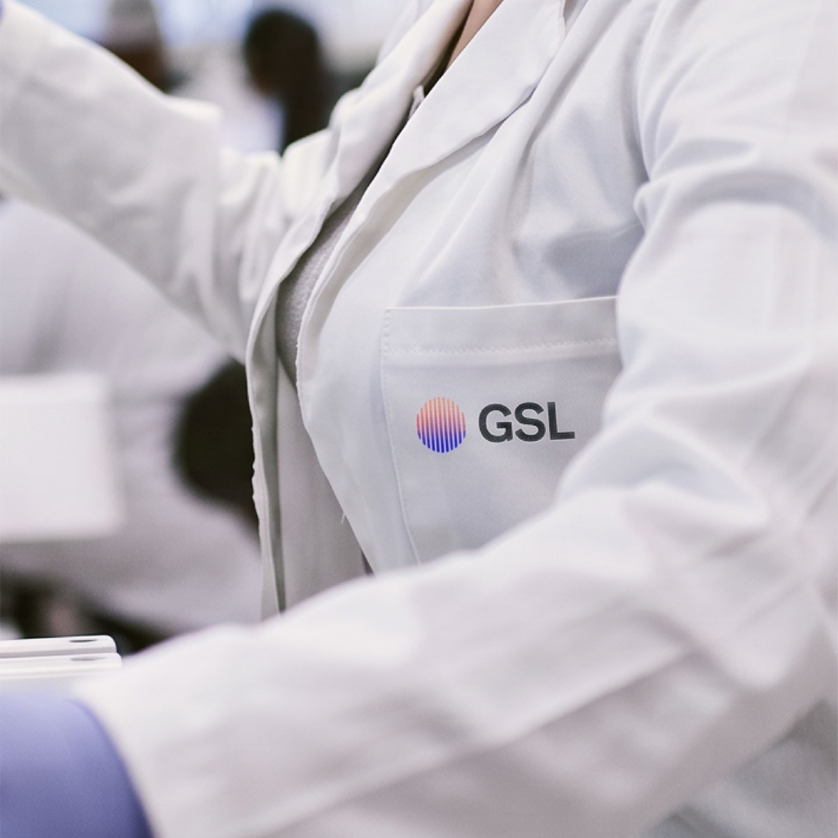
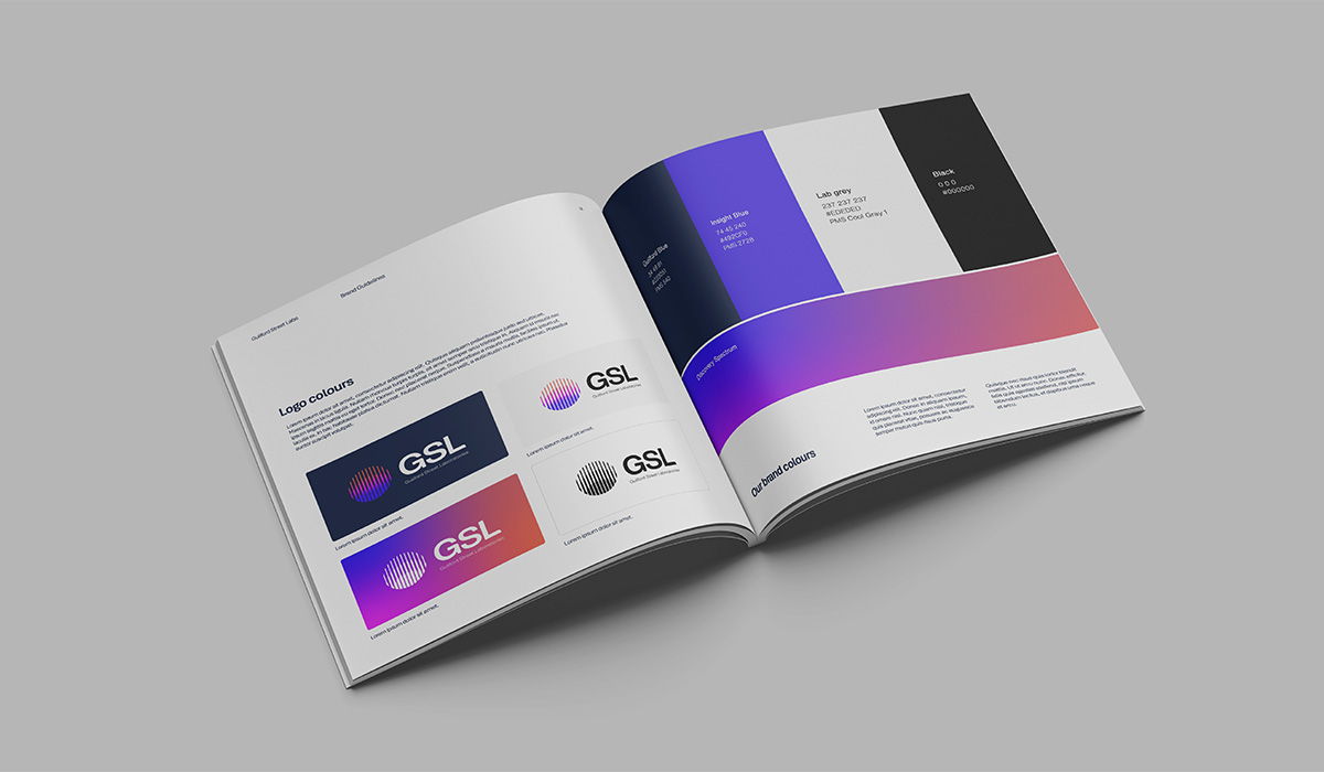
A logo with meaning built in. Three flowing curves, a stylised interpretation of layered biomarker signals, sit within a circle representing a complete diagnostic process. Vertical lines inspired by pipettes evoke precision and advanced analytical technology. The result is modern, approachable and unmistakably scientific.
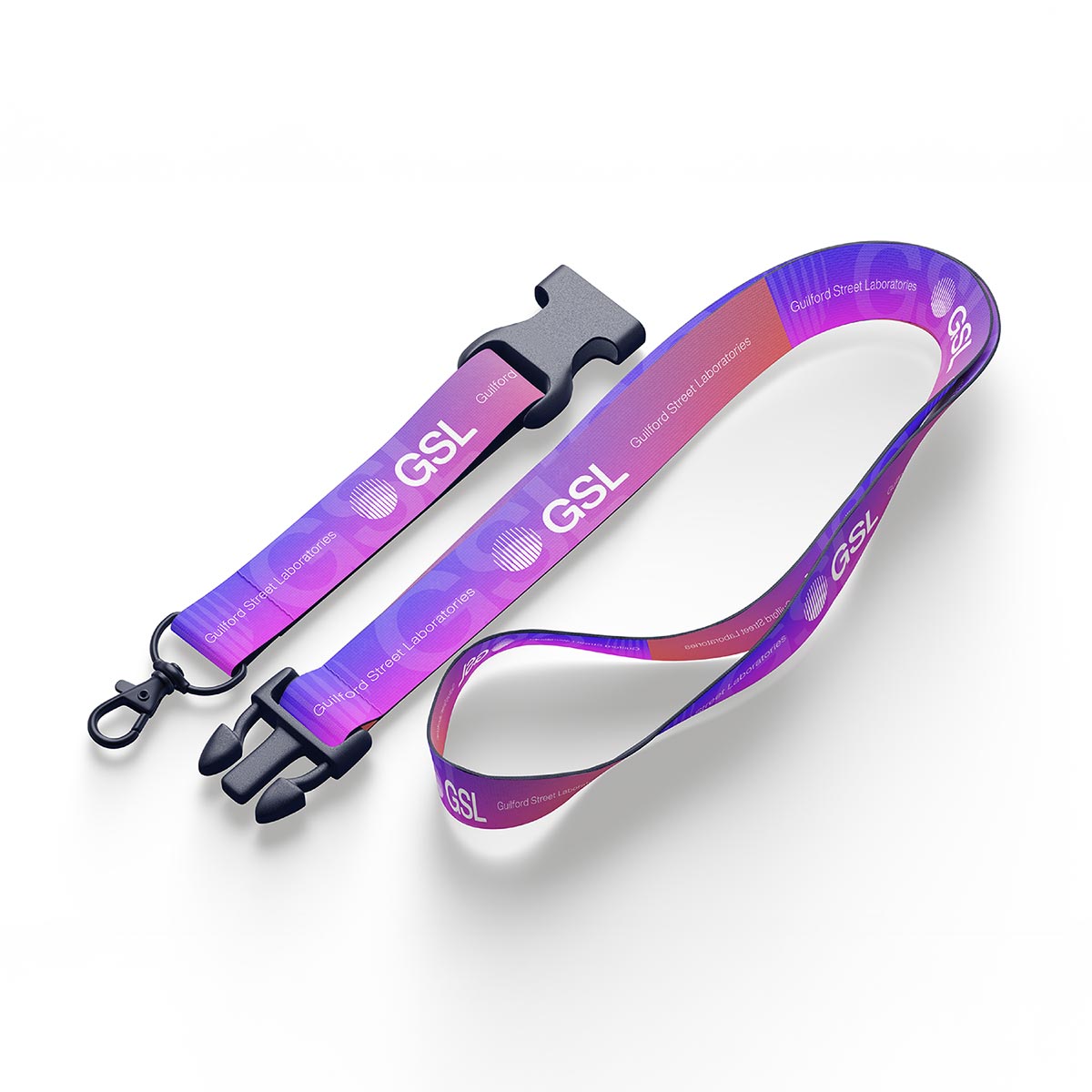
A palette that stands out. A distinctive colour palette gives GSL immediate standout, balanced with grounded neutrals that keep it credible.
Brand guidelines built for consistency. Comprehensive guidelines covering logo, colour, typography, imagery and tone of voice help the team apply the brand confidently across every touchpoint.
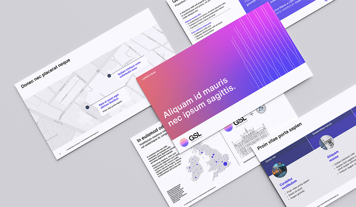
A presentation deck that makes the science shine. A flexible PowerPoint template makes complex data clear and compelling, so every pitch and partner update reinforces the brand.
GSL now has an identity that matches the ambition of its science. It stands apart in a market of lookalikes, while giving partners the confidence that they’re working with a team they can trust to help bring better treatments to patients, faster.


Head of Marketing, GSL (Guilford Street Laboratories)

© 2026 CLARITAS ALL RIGHTS RESERVED. PHOTOGRAPHY BY INBETWEEN DAYS. Privacy policy | Cookies